How I Made My Blog with Github, Jekyll and Material Design

Every day we learn new technologies, we know more about what we thought we knew everything and we solve problems. But most of the time, this knowledge is not passed forward, sometimes it only arrives to our coworkers. Thinking about it, I decided (finally) to create my blog. I decided not to use a out of the box blog, but to build one from scratch to learn something. This post talks about this experience and this blog where you are is the result.
Hosting from GitHub
To start the project, I needed some place to host my blog. I wondered the idea of renting an instance on Amazon EC2. There is nothing wrong with EC2, but when I met GitHub Pages I realized it was the ideal solution for my case. It is an easy hosting solution for websites with HTML, CSS, and JavaScript files. GitHub Pages offers free hosting for a site per GitHub account and organization, and unlimited project sites. On a daily basis there is no bureaucracy: just edit, commit and push your changes to update the site’s content. If the repository is public (my case), anyone in the community can contribute by submitting a pull request to improve the content of a post.
To create a personal site on GitHub Pages simply create a repository called username.github.io, being username your username on GitHub. Then, create an index.html file, add some content, commit and push your changes. Now, just go in the browser and access the site in http://username.github.io. For my persoal blog, I created a respository called bernardopacheco.github.io which can be accessed in http://bernardopacheco.github.io.
Although the bernardopacheco.github.io worked well, I wanted to put my custom domain bernardopacheco.net. After setting up my custom domain through my DNS provider, I had to say to GitHub to redirect any request with the host bernardopacheco.net to bernardopacheco.github.io. To do that, all I had to do was to create a file in the root of the respository called CNAME containing my custom domain.
More information:
- User, Organization, and Project Pages;
- About custom domains for GitHub Pages sites;
- Adding a CNAME file to your repository.
Blogging with Jekyll
Beyond the support of regular HTML content, the real power behind GitHub Pages is Jekyll, a simple, blog-aware static site generator. There is no database, just Markdown (or Textile) Liquid, HTML and CSS. Jekyll takes all your content, renders Markdown and Liquid templates, and generates a complete, static website ready to be served.
The main strengths of Jekyll are:
-
Powerful and flexible configuration through YAML files;
-
Easy page and post configuration using YAML Front Matter, a set of metadata to specify things like default layout, custom title, author name or a different date for the post;
-
Support for syntax highlighting of more than 100 languages with Pygments or Rouge;
-
Support for the Liquid templating language to easily HTML markup through variables, tags and filters;
-
Flexible way to customize the permalinks of the site.
Jekyll is a really fantastic tool that together with GitHub Pages made the development of this blog less painful and more fun.
Makeup with Material Design
Material Design is a design language developed by Google that uses grid-based layouts, responsive animations and transitions, padding, and depth effects such as lighting and shadows. It’s an evolving spec which has continuous releases. I used this design language to build the blog layout. So, did I use every aspect of the specification? No way. The material design covers various topics, some make sense for my blog, others not.
Typography
The typographic section recomends the standard typeface Roboto. It is a beautiful font that has been refined to work across the wider set of platforms. To avoid a messy layout, the styles was based on a typographic scale of 12, 14, 16, 20, 34, and 42 px. Furthermore, I considered this advice on readability and line length from the Baymard Institute: “You should have around 60 characters per line if you want a good reading experience. Having the right amount of characters on each line is key to the readability of your text.”.
Text colors and palette
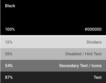
The material design has an entire section to inspire you about colors. One interesting tip was the different shades for text, icons and dividers to make a hierarchy of information. The image below presents the color scale adopted:
As my primary and secondary color palettes, I liked these ones to menu, link and text selection colors:
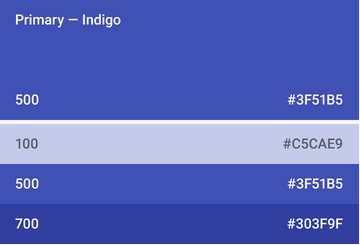
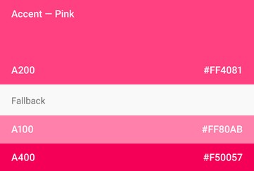
Not all colors were used, only the primary 500, primary 700, accent 200 and accent 400 were sufficient to compose the final color palette.
GitHub and Disqus API integration
In the lower left corner of this blog, there are two informations about this
repository on GitHub: stars counter, a way that people bookmark your project,
and fork counter, how many copies of your project were made. To fecth the summary
representation of the repository through the GitHub API, I just called
https://api.github.com/repos/bernardopacheco/bernardopacheco.github.io?callback=yourcallback and got
stargazers_count and forks properties. Because I was using JSONP,
a callback property must be passed in the query string.
Another API integration was made with Disqus. Disqus is a networked
community platform that provides a feature-rich comment system to leverage the
community discussion about some post. This blog utilizes three pieces:
comment system widget, comments count and recent comments widget. The first two
were installed with a drop-in code snippet. The last one, recent comments
widget, was a custom component built with the Disqus API. To fetch a
post’s list of comments, I called https://disqus.com/api/3.0/forums/listPosts.jsonp?forum=bernardopacheco&related=thread&api_key=<apikey>&callback=yourcallback,
being api_key my public API key value on Disqus and a callback to get the
response of the JSONP request.
Being smarter with Grunt
The Grunt Task Runner help me to automate the repetitive tasks like minification, concatenation, compilation and linting of the source code while building the project. You can check all the tasks and it’s settings in the Gruntfile.js file. In fact, I would like to highlight one particular task and it’s results: the grunt-uncss task. Powered by PhantomJS, the grunt-uncss task removes unused CSS. This blog uses the Twitter Bootstrap and the Font Awesome libraries, but it uses less than 10% of the CSS they provide. As a result, they can end up with inflated stylesheets which can significantly increase page load time and affect performance. Yes, performance matters. As Jakob Nielsen said in his Website Response Times article, “[…] people engage more with a site when they can move freely and focus on the content instead of on their endless wait.”.
The figure below shows a piece of the output generated from the execution of the Grunt’s tasks:
The first task less:build concatenates and compiles all the less source code
and generates a single stylesheet file with 167.88 kB in size. The next task
uncss:dist removes all the unused CSS reducing the file size of 167.88 kB to
17 kB, that is, 90% of the stylesheet was removed. The last task less:dist
minifies the cleaned stylesheet reducing the file size of 17 kB to 11.84 kB.
Thus, reducing of 167.88 kB to 11.84 kB, this shows that only 7% was a useful
stylesheet code.
One last comment: You may have noticed a pattern in the name of the generated
files. To prevent the browser using an old version of a cached file
while there is a newer version of the same file, the name of the stylesheet and
script files is generated in the form <github-username>-<blog-version>.[css,js],
for example, bernardopacheco-1.0.0.css and bernardopacheco-1.0.0.js.
Start your own blog!
Anyone is welcome to clone, fork and contribute to this project. If you are interested in making your blog from this project, you have to install the following dependencies:
In the root directory of the repository, run the following commands:
npm install // install node modules
bower install // install client side libraries
jekyll build // build the site
grunt // build project
jekyll serve // run the site
After these commands, you can go in your browser and access the site locally in
http://0.0.0.0:4000.
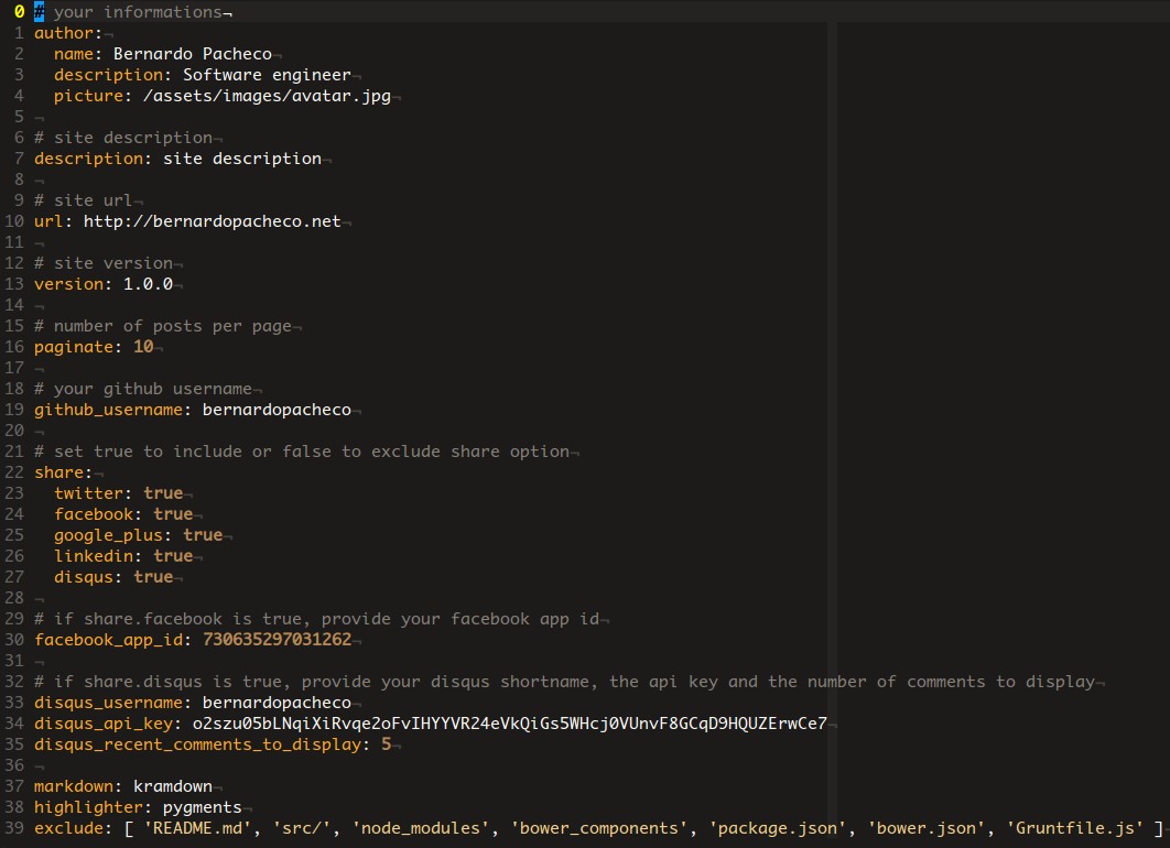
To customize the blog with your informations, you need to change two files:
_config.yml and src/css/variables.less. Here is the content of the
_config.yml file:
The properties are self-explanatory. With these informations, all the site
structure are generated, including file names, share options, number of posts
per page, GitHub links, repository status and Disqus widgets. For instance,
in the share section, if you don’t want a Facebook share button, just set
the facebook property to false and the Grunt automation process will be
responsible for removing the Facebook share script of the final generated script
file. Nice!
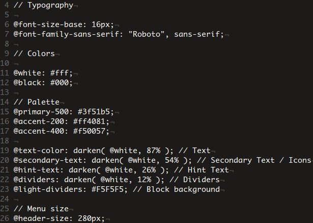
This is the content of the src/css/variables.less file:
If you want to alter the typography, you can change the font size and font family. You can also change the primary and secondary color palettes, as well as the text colors hierarchy. If you wish to increase or decrease the width of the side menu, you can also do it. Now, if you want to make other changes that are not possible via configuration files, do this, touch the source code and hack something! It will be great to see other creative solutions!

